momo - це морозиво, яке асоціюється з насолодою смаку, спробувавши відразу потрапляєш в дитинство, в світ мрій та казок.
Виготовляється з натуральних складників. ЦА аудиторія дорослі та діти, тому бренд уособлює смак свіжих фруктів, який надає свободу, спокій та перепочинок.
Виготовляється з натуральних складників. ЦА аудиторія дорослі та діти, тому бренд уособлює смак свіжих фруктів, який надає свободу, спокій та перепочинок.
momo is an ice cream that is associated with the pleasure of taste, after trying it, you immediately fall into childhood, into the world of dreams and fairy tales. It is made from natural ingredients. The target audience is adults and children, so the brand represents the taste of fresh fruit, which gives freedom, peace and rest.


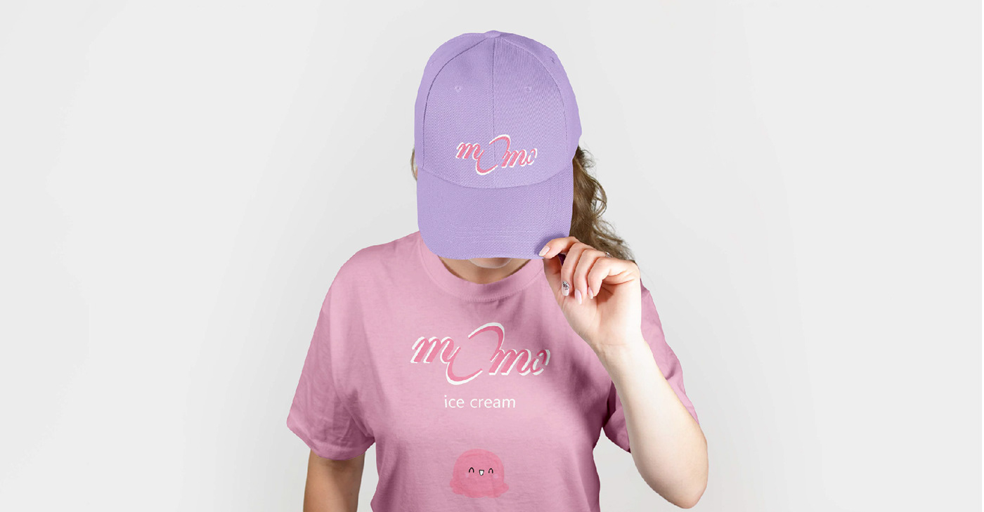
Логотип виконаний з округлих форм, які асоціюються з кульками морозива. Акцент поставлено на літері О , оскільки вона поєднює велику аудиторію людей, смаків. Щодо палітри кольорів, то це рожеві, фіолетові та білі відтінки, які підкреслюють смак морозива і впевнено розподіляють акценти.
The logo is made of rounded shapes that are associated with scoops of ice cream. The emphasis is on the letter O, as it unites a large audience of people and tastes. As for the color palette, it is pink, purple and white shades that emphasize the taste of ice cream and confidently distribute accents.